I carried out some research to determine the typographical and layout choices commonly made for three different types of publication.
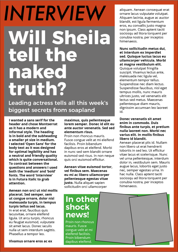
- An interview with an actor in a listings magazine entitled ‘Will Sheila tell the naked truth?’
Tv listings magazines make use of lots of different typefaces and fonts. The headings are often a sans serif typeface which is emboldened and in colour. The body text is arranged in short paragraphs and often in a question and answer format with the question text in bold or colour. In the examples I looked at there was an even mix of sans serif and serif typefaces used for the body text.
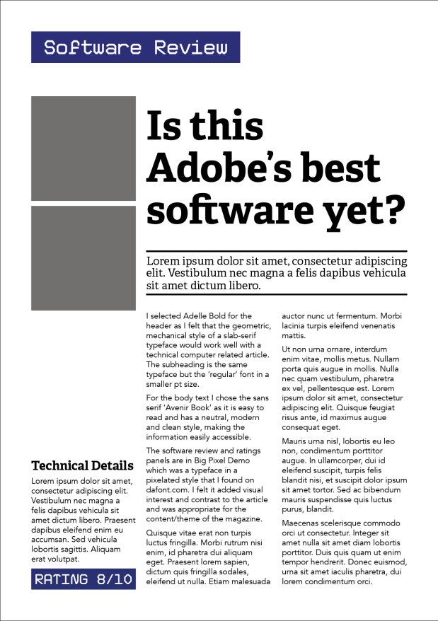
2. A review of a new piece of hardware or software in a specialist computer magazine
Articles relating to computers and technology have predominately slab-serif or sans serif headings for a mechanical and modern look. The information tends to be divided into sections with boxes, coloured text and subheadings used to create differentiations. There is limited colour in the articles and the colour choices for subheadings are muted blues and reds. Both serif and sans serif typefaces are used for the body text.
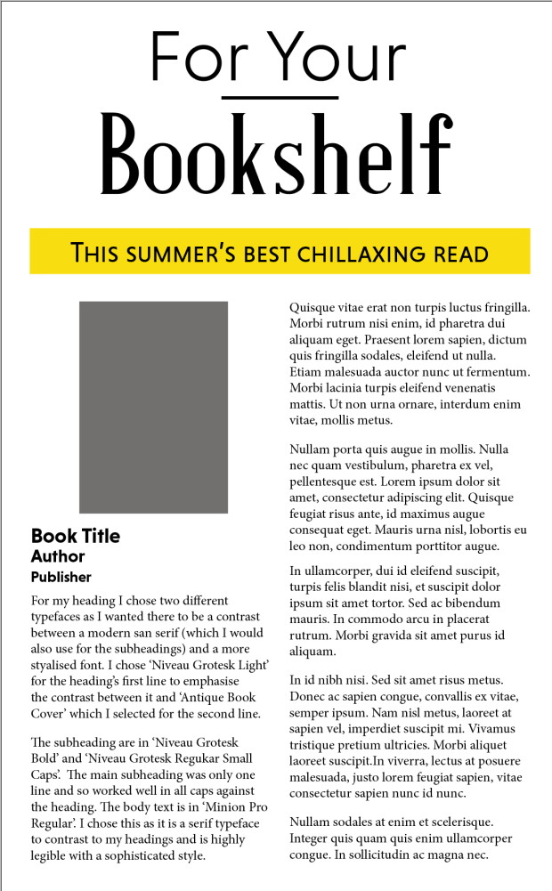
3. A book review in a newspaper’s weekend edition
The book reviews I looked at were generally two columns with bold sans serif headings, and serif body text. Information is prioritised with the use of bold, pt size and typeface, especially in detailing the title, author and publisher of the book. The overall tone of the articles tends to be modern and classically elegant.
I then designed my own version of each of the articles detailed above and selected a combination of typefaces to use for the headings, subheadings and body text.


